
Overview
This video was created to visualize an audio clip with typography, I chose to represent the skit "Facebook Story" by Frank Ocean. Each transition and effect implemented was carefully considered in relation to the lyrics and the overarching story being told by the narrator.
Final Composition
Project Brief
Create a kinetic typography animation of at least 30 seconds synced in some way to an audio clip. The typography should be the focus of your design and should be presented in such a way that can be easily read in the time it is on screen. Special attention should be paid to how the fonts, colors, and animations match the style of audio and contribute to the overall design.
Process Work
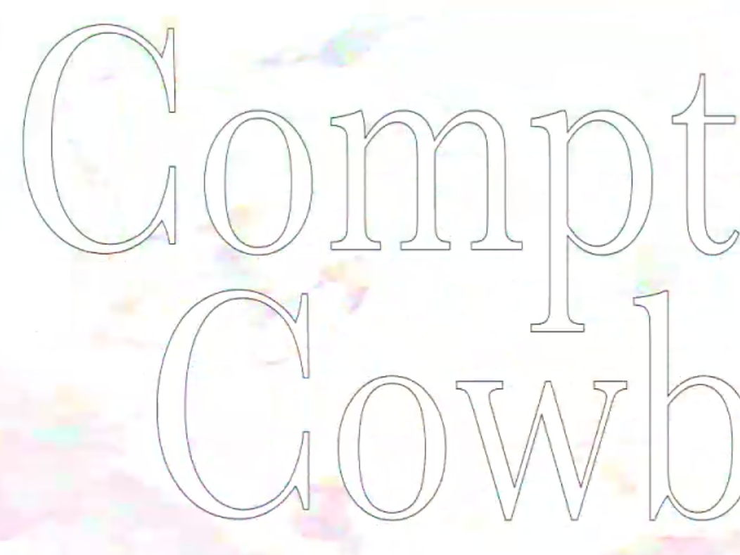
The first 30 seconds show a solid start, with me getting the hang of transitions and timing as well as defining a core color scheme and primary typeface, Helvetica.
In the second version, I slowly started to integrate effects and played around with additional typefaces and decided to do the full skit.
Artist Statement
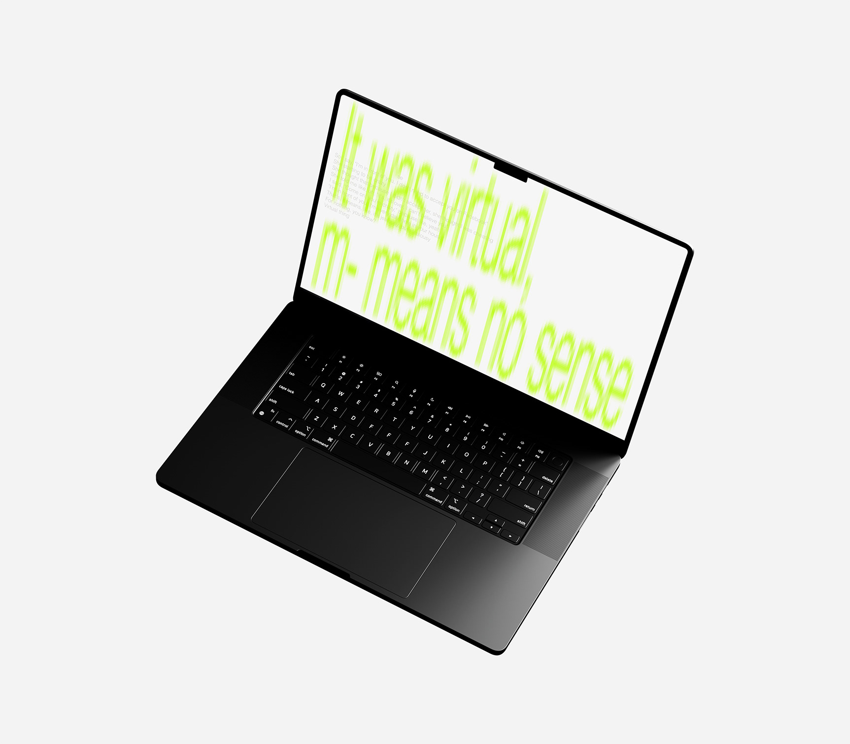
The 16th track on Blonde, "Facebook Story," has always stood out to me. The use of Helvetica is a nod to Facebook’s original interface and the early 2000s digital era, when smartphones began their path of destruction on social interaction and human relationships. Intimacy can disappear in one click, the emotional detachment is real, and I'm sure anyone reading this has noticed something of the sort in the world around them. The neon color scheme also references Y2K culture. Neon colors are lifeless and ingenuine, unnatural pigments created by man. Like how the ex-girlfriend severed this relationship over a lifeless friend request—a bright, rash decision made without a human in mind. Excessive screen time can significantly affect our eyes by causing "digital eye strain," which includes symptoms like dryness, irritation, blurred vision, headaches, and eye fatigue. I chose to reference this issue with a blurry effect on the type.