
Overview
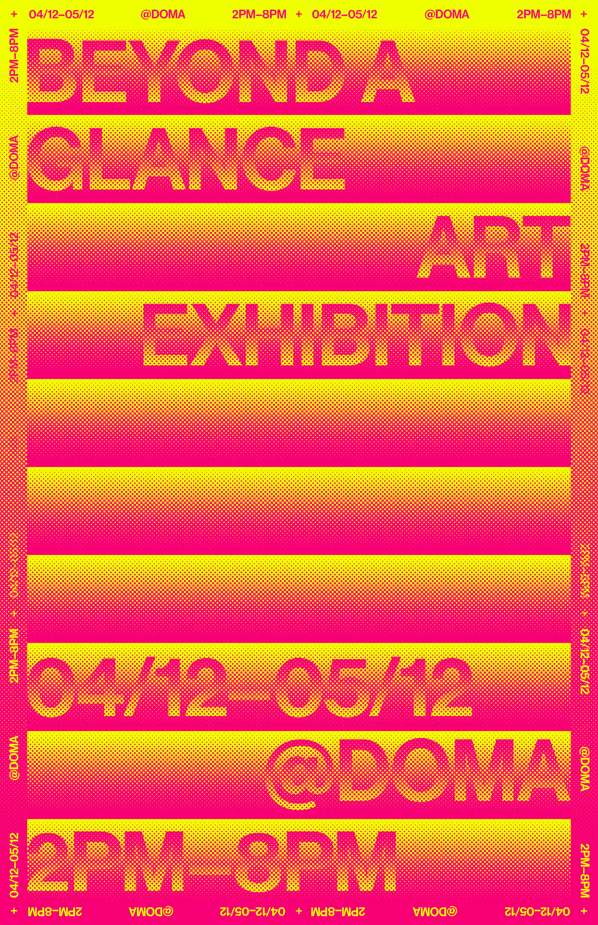
This poster was created to advertise Beyond a Glance, an art exhibition displaying works that contain hidden meanings and references. I wanted to continue the hidden message/meaning motif throughout the poster.
This poster was created to advertise Beyond a Glance, an art exhibition displaying works that contain hidden meanings and references. I wanted to continue the hidden message/meaning motif throughout the poster.
Process
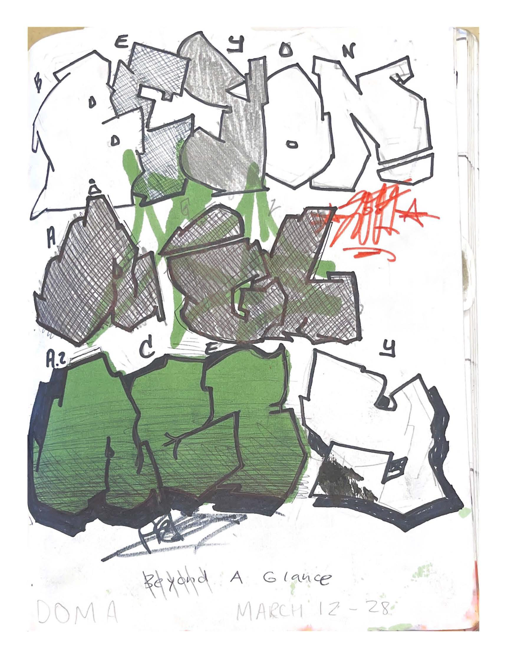
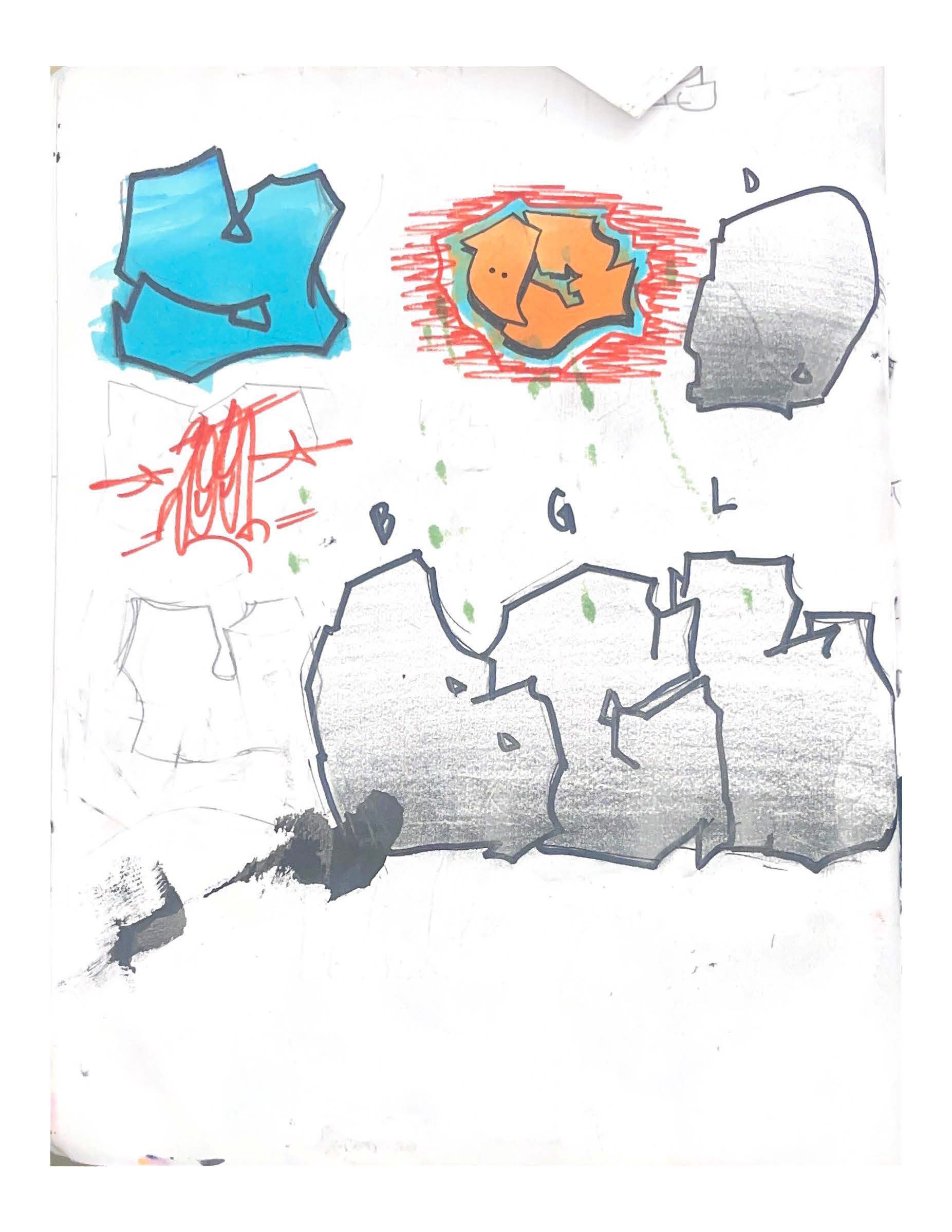
Initially, I had the idea of taking inspiration from wildstyle graffiti letters, focusing less on immediate legibility, and instead opting for a stimulating experience that drew the viewer in. After sketching out some letters I realized reliability should be prioritized more.
Initially, I had the idea of taking inspiration from wildstyle graffiti letters, focusing less on immediate legibility, and instead opting for a stimulating experience that drew the viewer in. After sketching out some letters I realized reliability should be prioritized more.
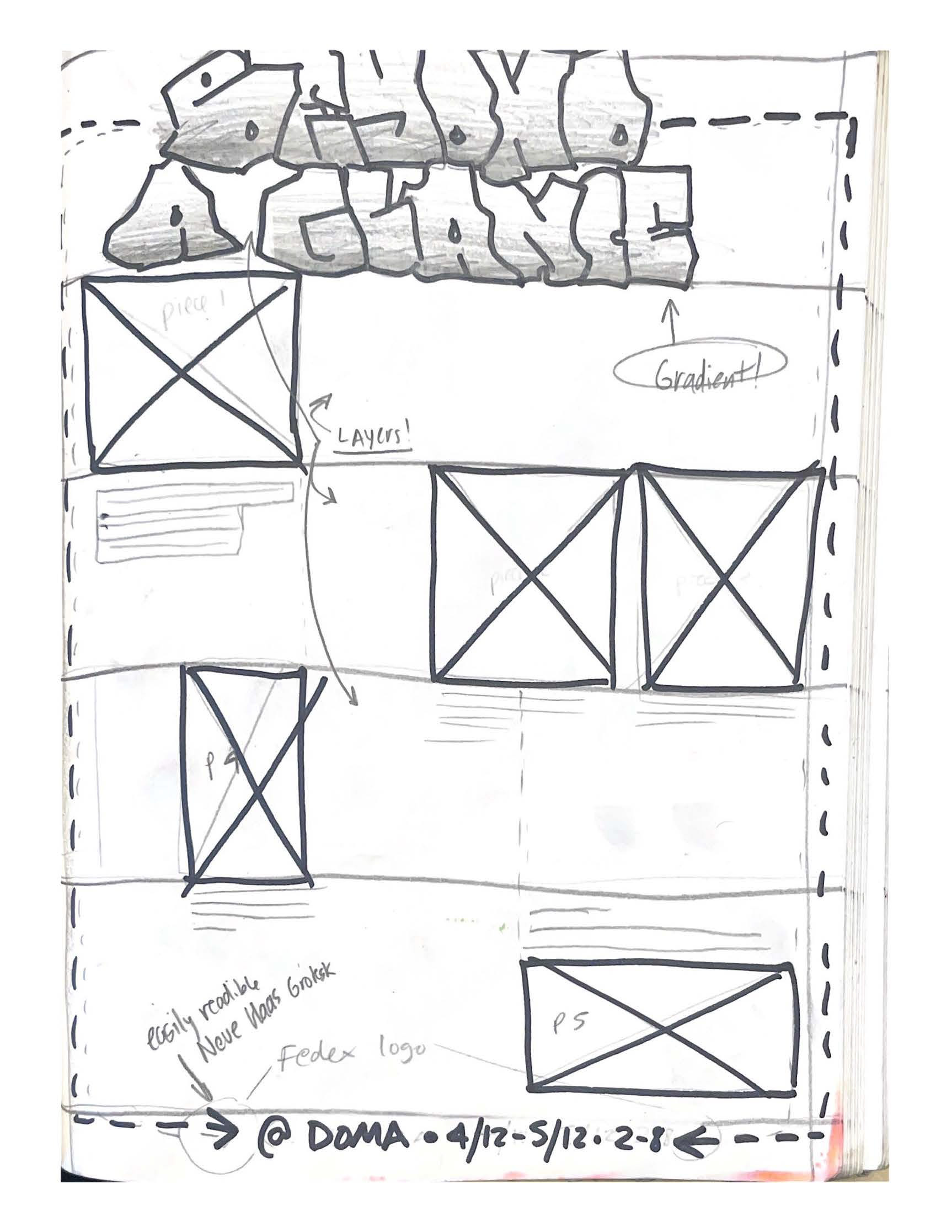
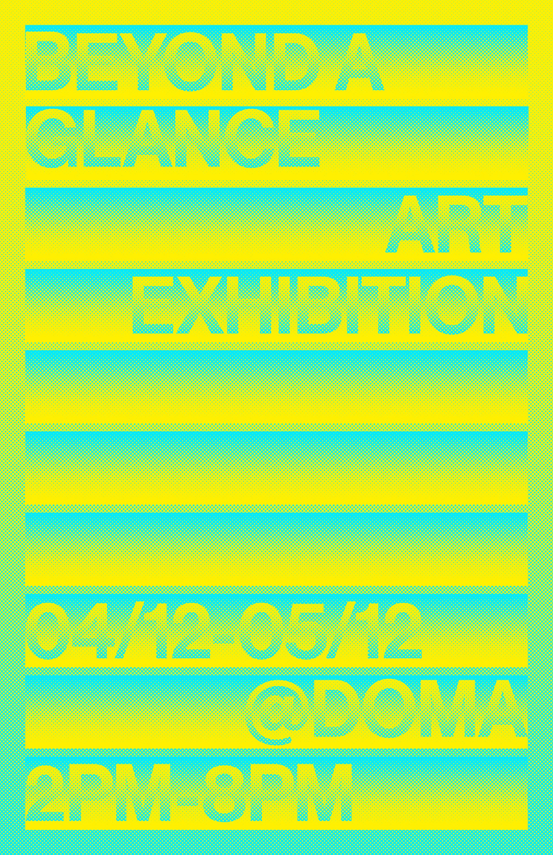
Moving on I chose to experiment more with gradients, digitally. Early drafts exposed issues with readability and accessibility; people with color blindness could have problems with bright colors. Also, essential information like the date, time, and location were getting lost.
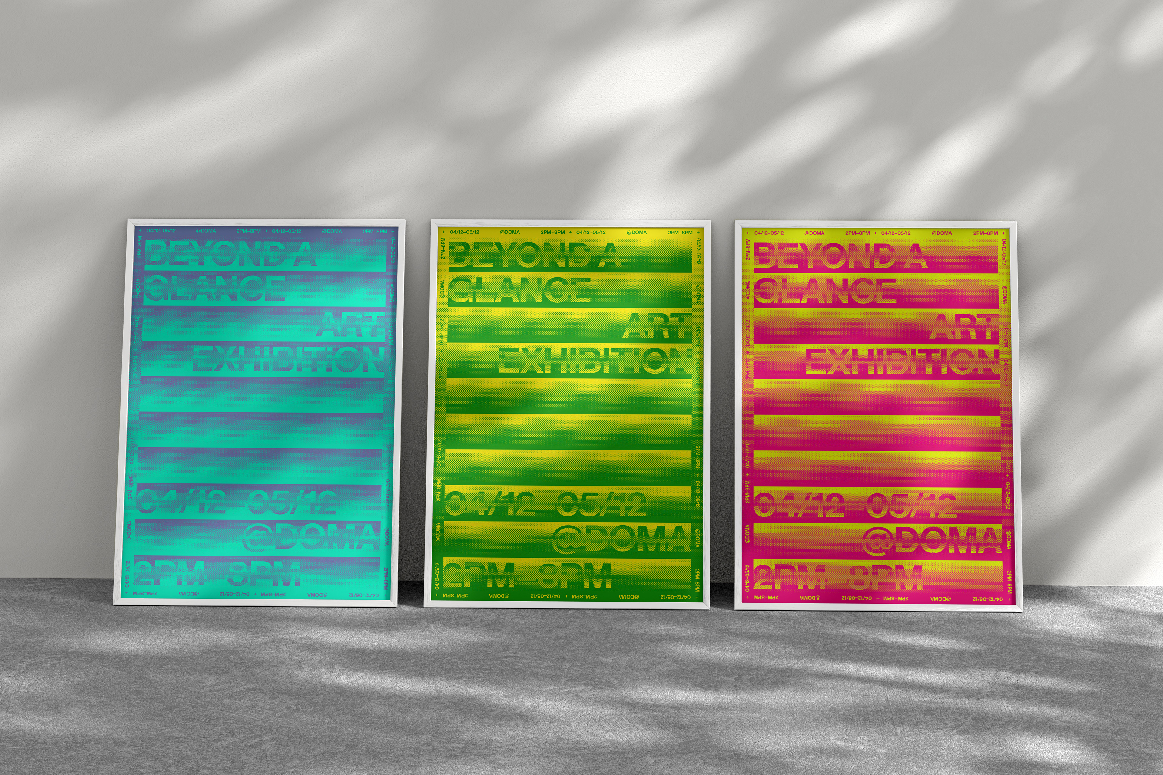
Final Series
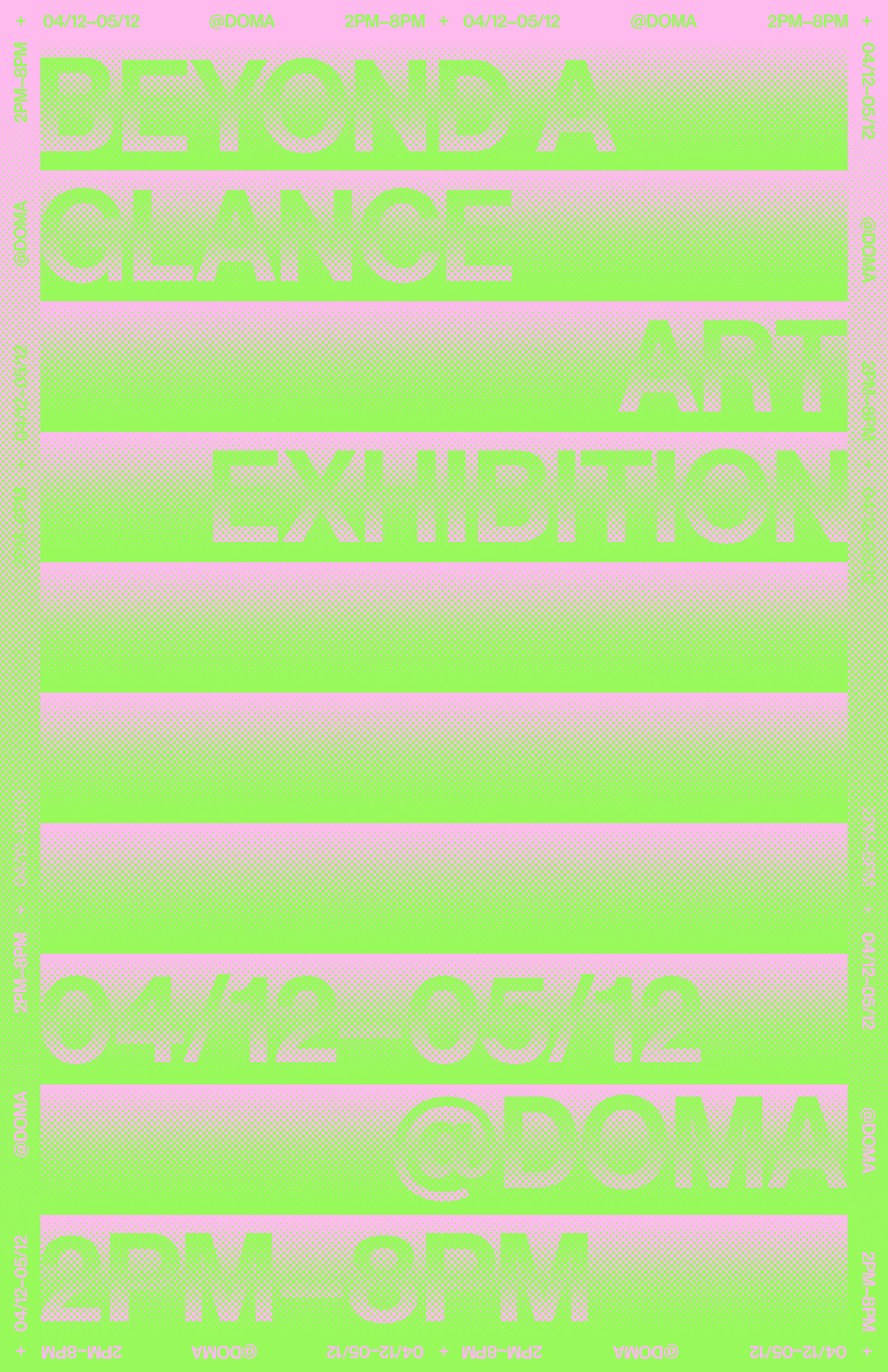
Bright colors draw in the viewer, the hidden message motif comes across via the halftone, and readability is guaranteed with the information displayed on the borders. Finally, I ran the document through Coblis.com to make sure the poster could be viewed by a wider audience.
Bright colors draw in the viewer, the hidden message motif comes across via the halftone, and readability is guaranteed with the information displayed on the borders. Finally, I ran the document through Coblis.com to make sure the poster could be viewed by a wider audience.