
Overview
When Fiddlers Hearth looked to tap into their younger crowd, they turned to me for an innovative and exciting branding identity and package designs that would catch the attention of 20-somethings out and about. Here’s how my approach, research, and personal connection transformed the Fiddlers Hearth brand.

Challenge
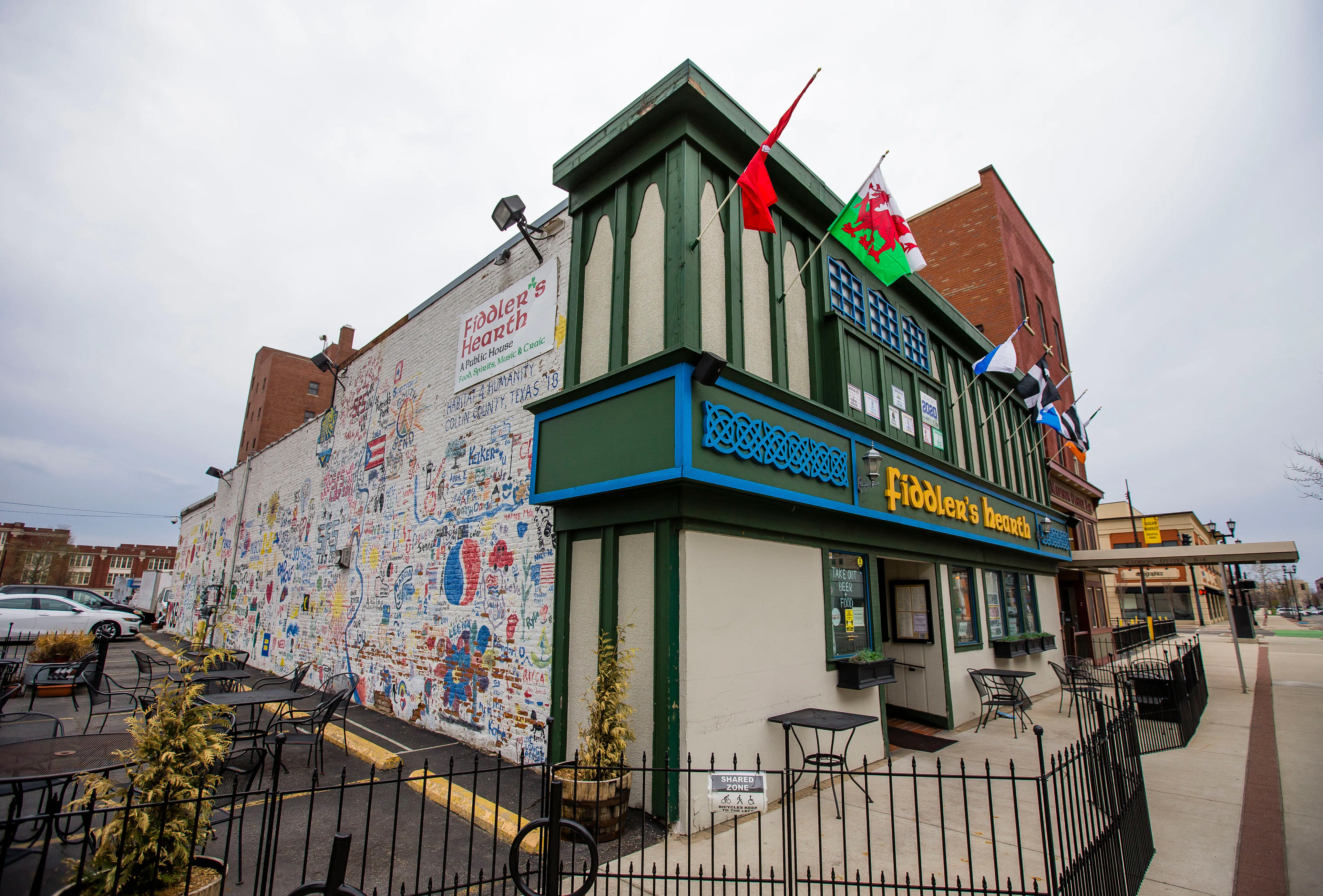
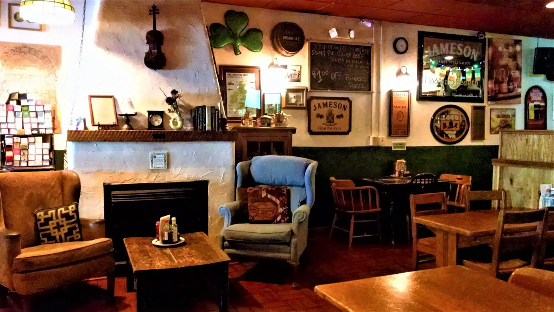
Fiddlers Hearth has traditionally kept branding simple, letting the food and reputation do most of the talking. On top of this Fiddler's Hearth has a dedicated community of regulars and families that have fallen in love with the pub atmosphere. Aside from the live music and a great shepherd's pie, they're known for the endless Celtic trinkets and ephemera covering the restaurant. This place has South Bend and Celtic tradition woven into the floorboards. Nevertheless, a unified branding identity has proven time and time again how successful it can be for businesses.
Audience
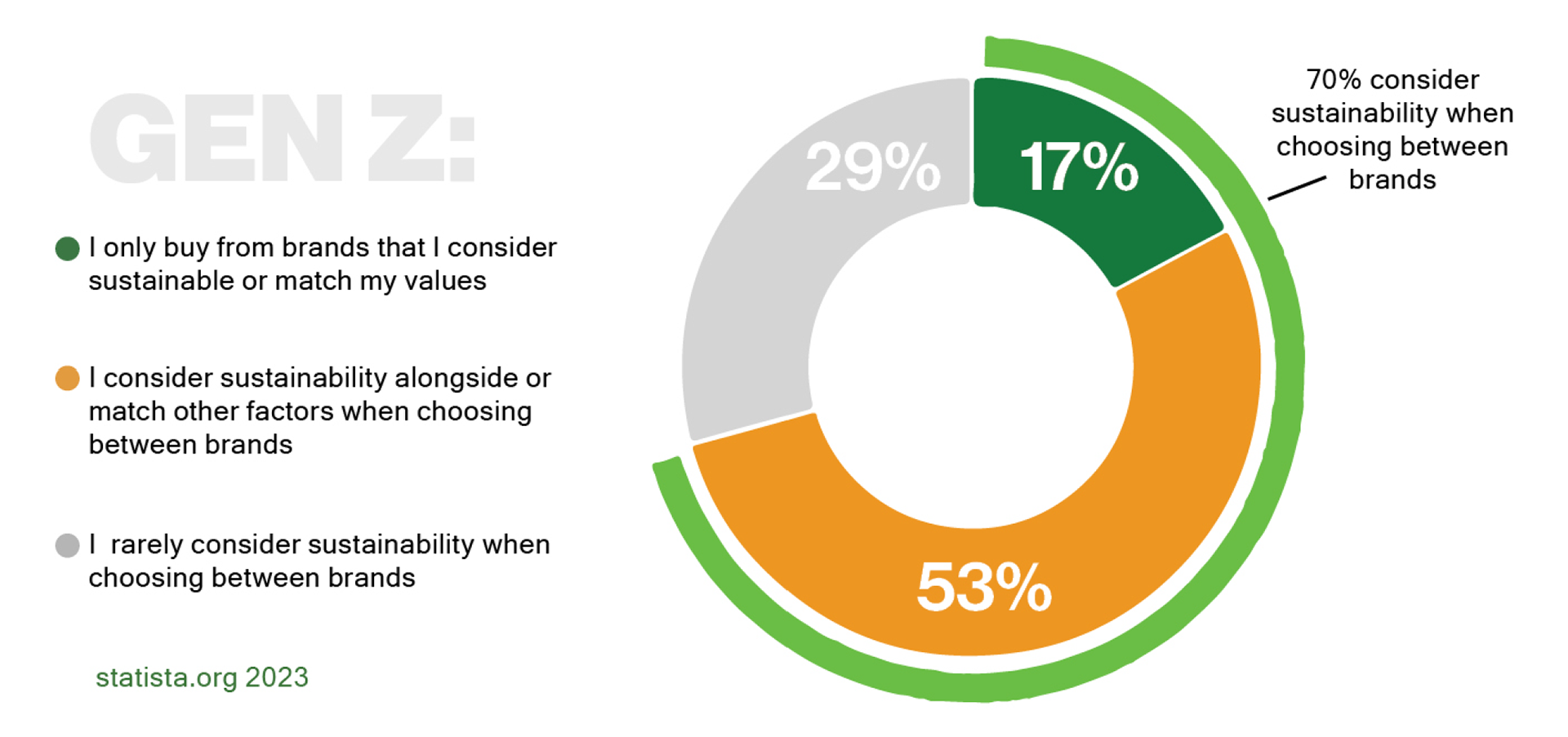
While regulars make up a lot of Fid's customer base, a respectable chunk only attends on the weekends, after dark, and they even gave the restaurant its unofficial nickname, Fid's. Notre Dame is a private, catholic university 10 minutes away from downtown. The University brings in 13,000 students every year and "75% of students come from the top 20% of income earners." With such a favorable market, I saw huge potential in creating a brand identity that spoke to these college students: Gen Z 20-somethings that had a special knack for Irish tradition.
Research
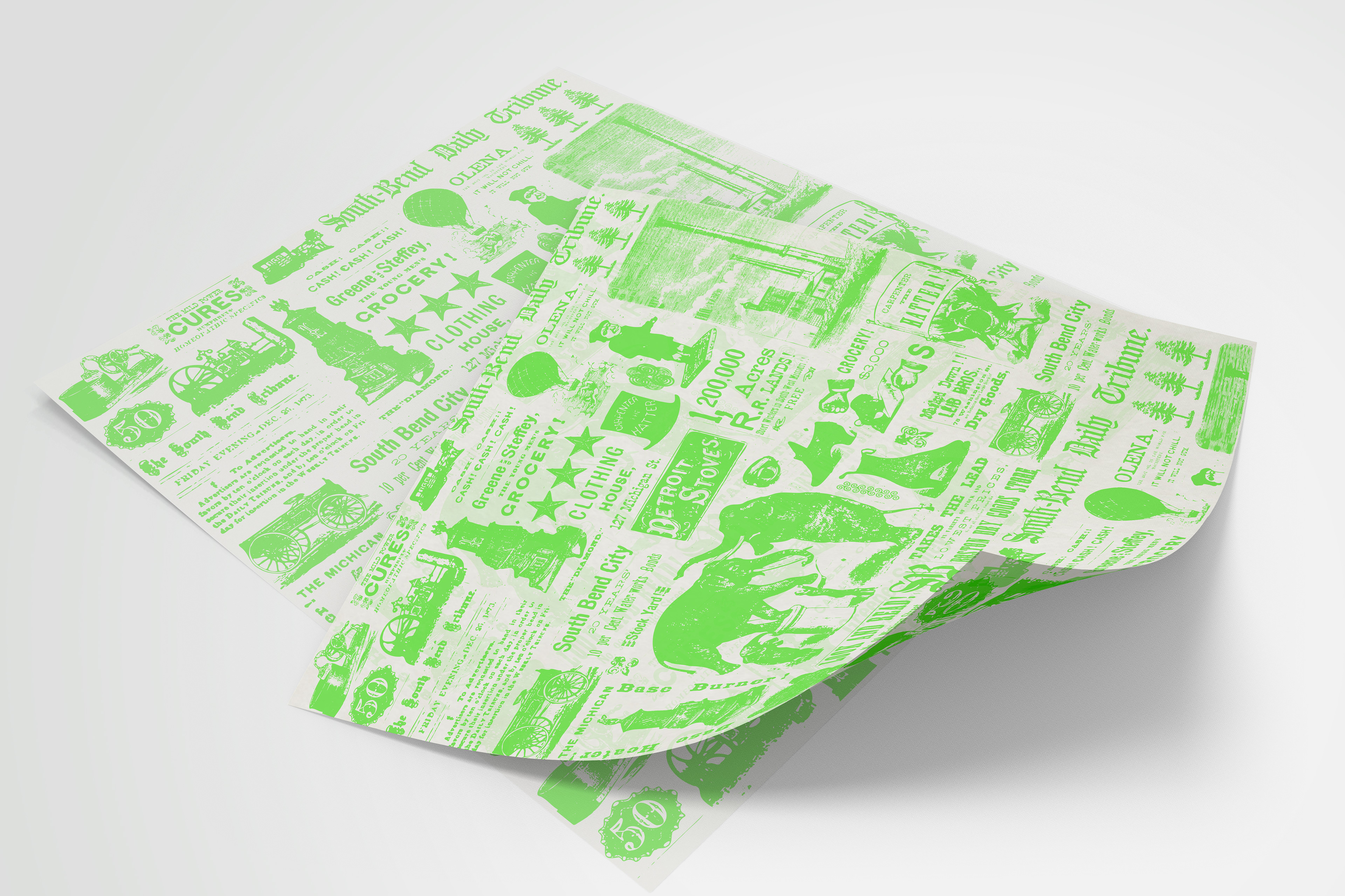
Regarding the restaurant itself, it wasn't too difficult to gather info as my family and I have gone every St. Patrick's day before I left for school. One thing that stuck out was the fact that they pride themselves in wrapping their fish n' chips in the South Bend Tribune, the local newspaper. Also, I mentioned the trinkets and ephemera before but the outside has a community graffiti wall as well. In terms of audience research, I looked at recent food trends and purchasing patterns. several things were of note: Genz loves neon colors, and they do especially well in social media advertising, they care about the planet and take sustainability, or perceived brand sustainability, into account before making a purchase.
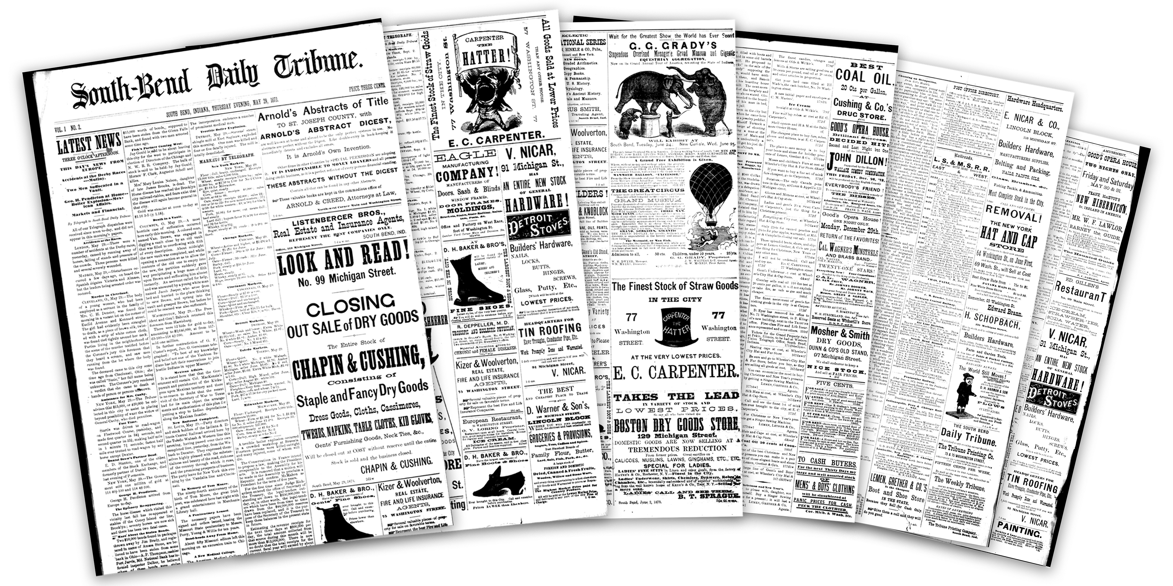
Scans from an 1873 issue of the South Bend Daily Tribune I sourced from my local library's microfilm archive
Process
After research, I asked myself how I could connect all these key findings, sustainability, newspaper, neon colors, trinkets, Celtic tradition, etc. I started by looking into old issues of the South Bend Tribune. My local public library has an archive available to view on microfilm, so I started there
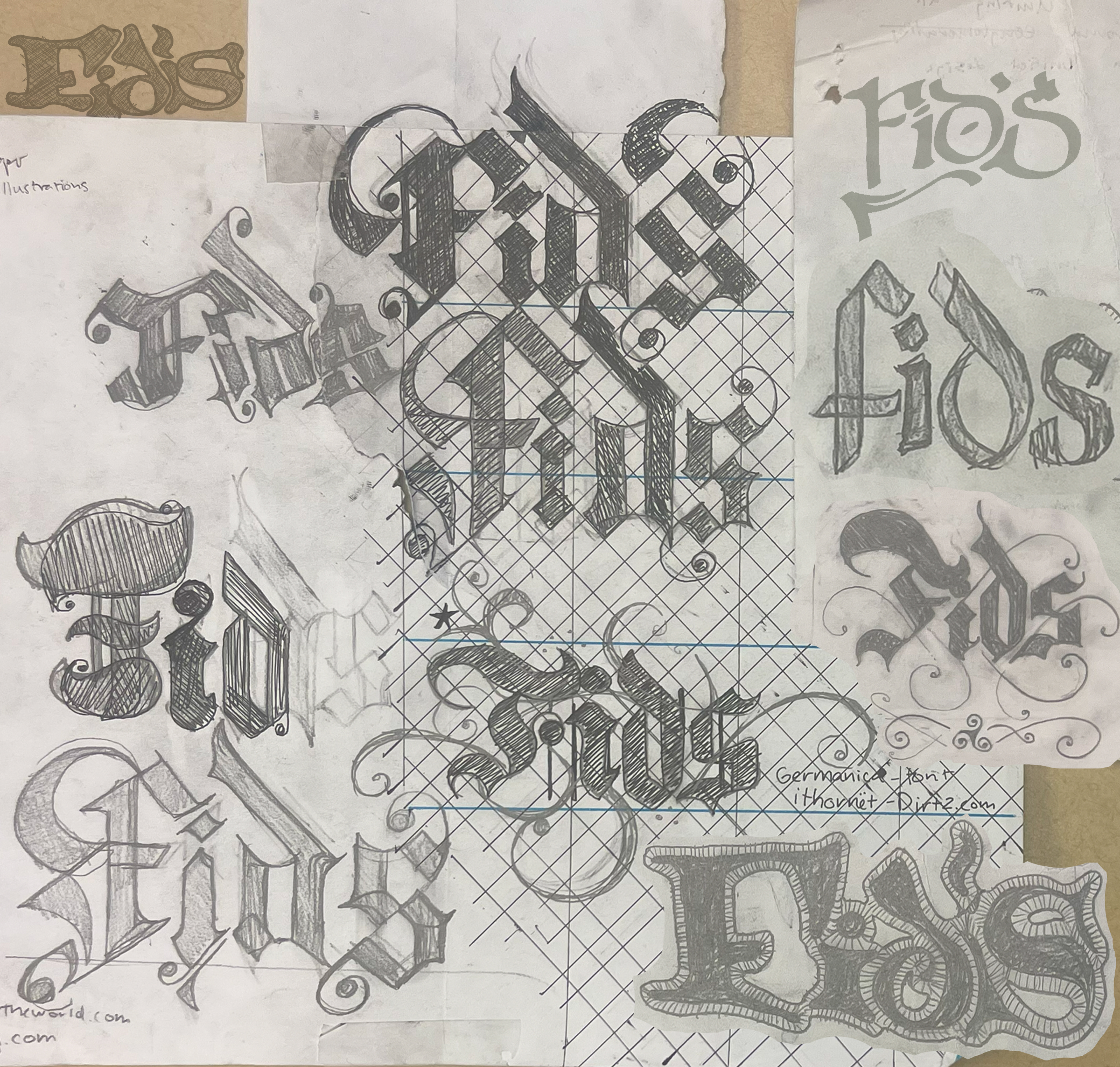
Process Sketches
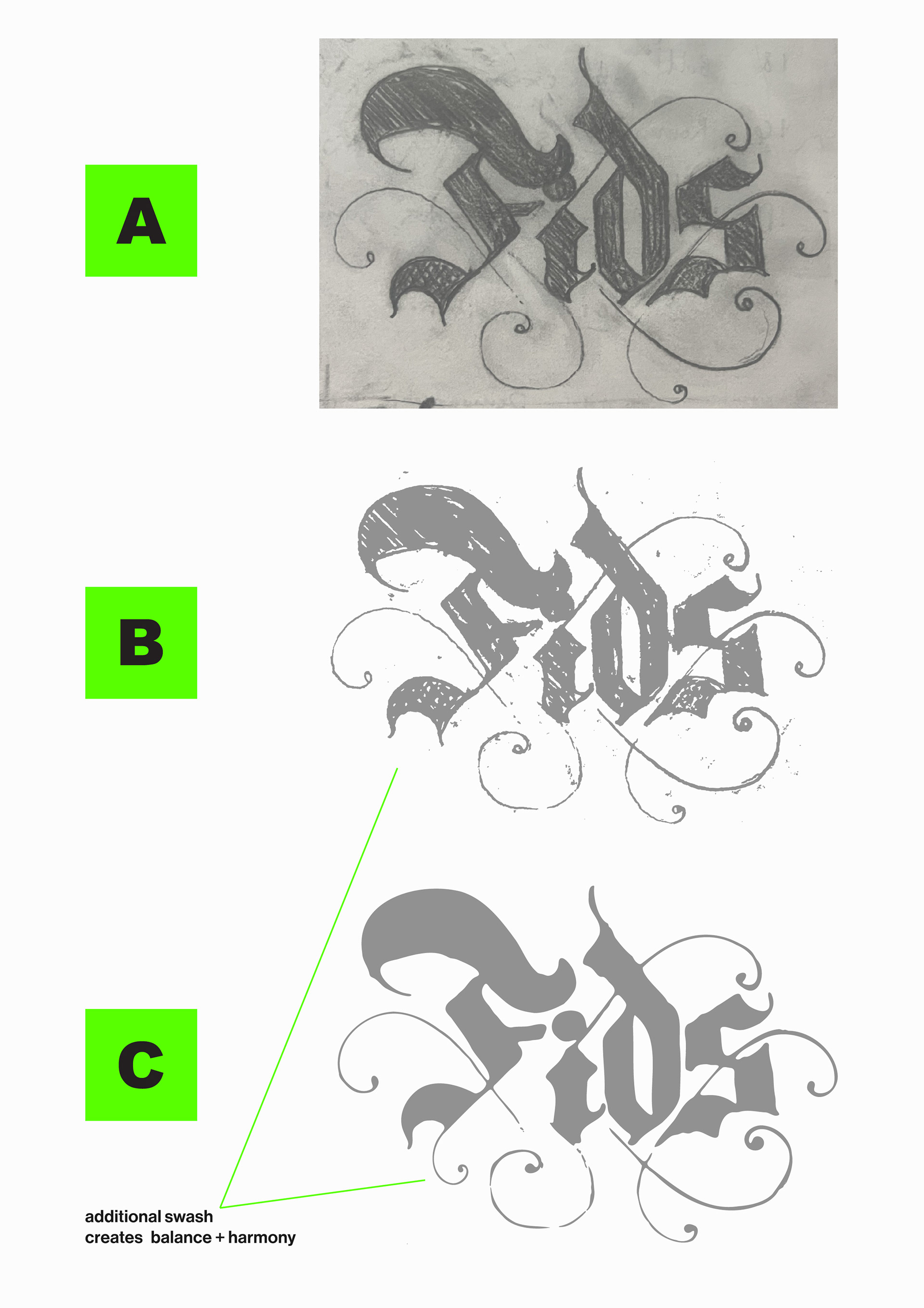
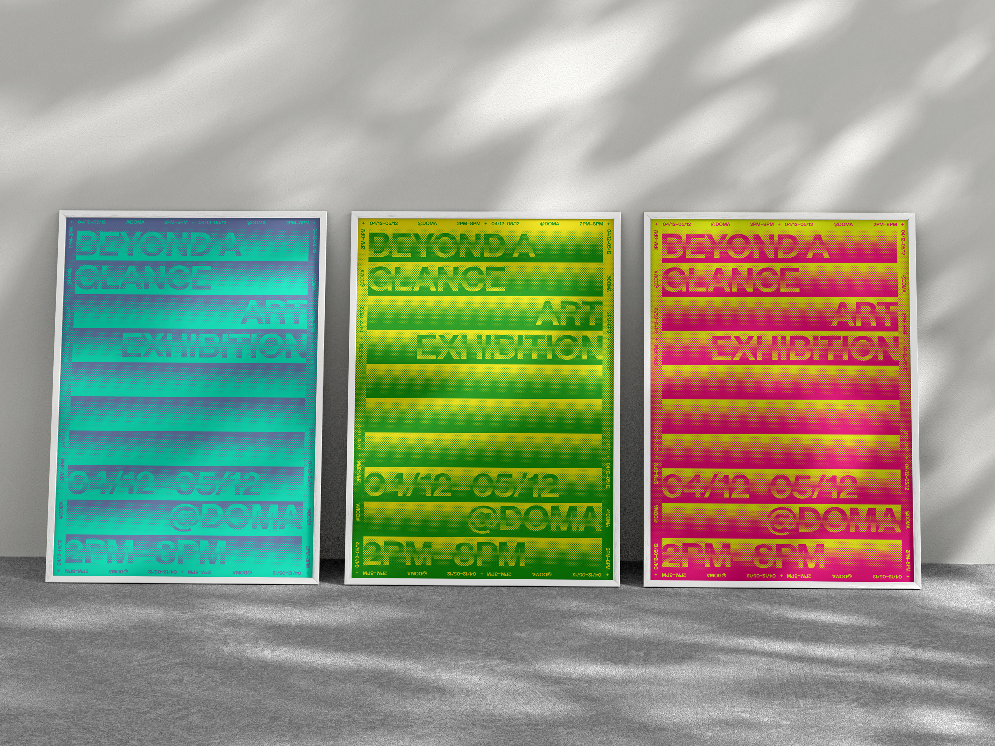
Finalized sketch to vector + touch ups
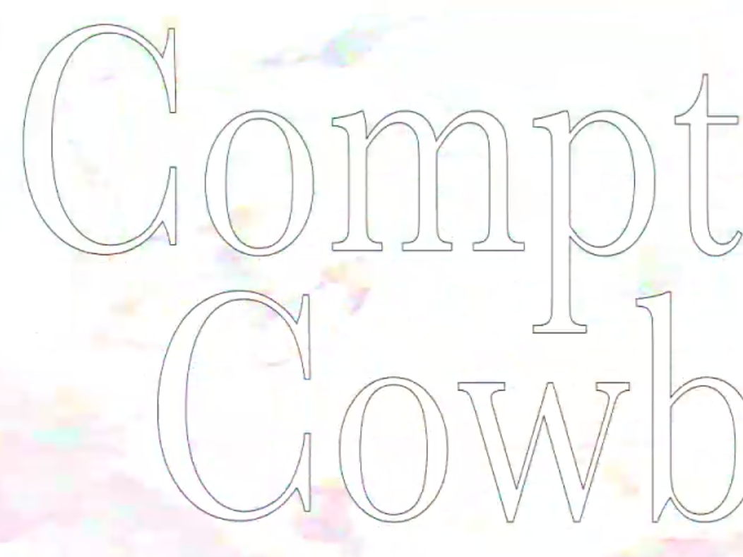
For the logo, I implemented the nickname given by students because of their connection to it but also, shortening it allowed me to create a more bold design. Its almost square proportions allow it to fit on packaging, merch, etc easily and be scaled as big as possible. I was largely inspired by Celtic wrought Ironwork as it is important within Celtic history. Specifically, the La Tène period as it's not only beautiful but also distinctive to Celtic tradition. With the letters, I created a custom black-letter type, as it's been traditionally used for newspaper mastheads since... well ultimately since Gutenburg decided so.
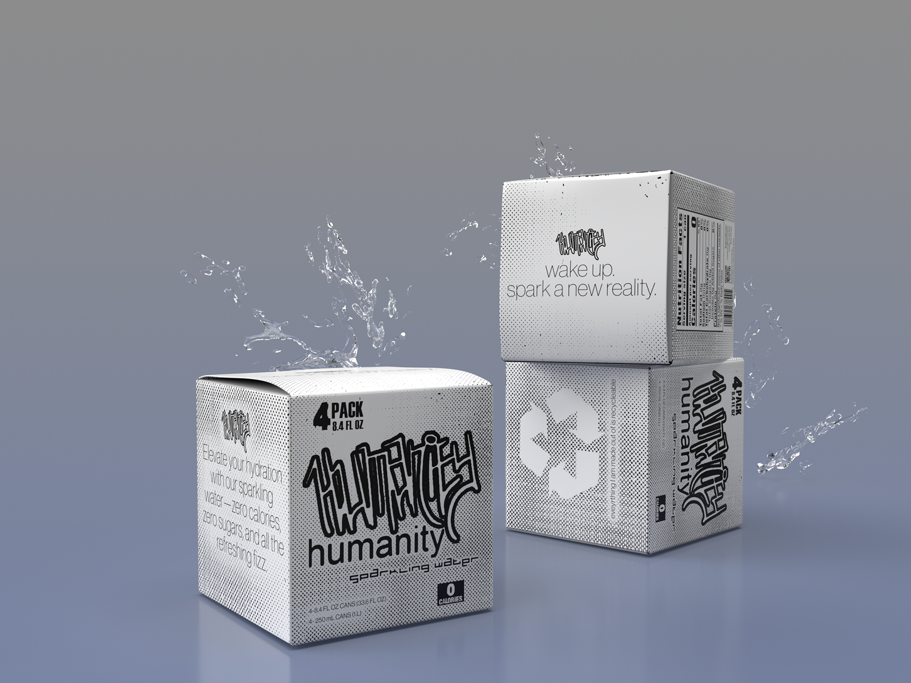
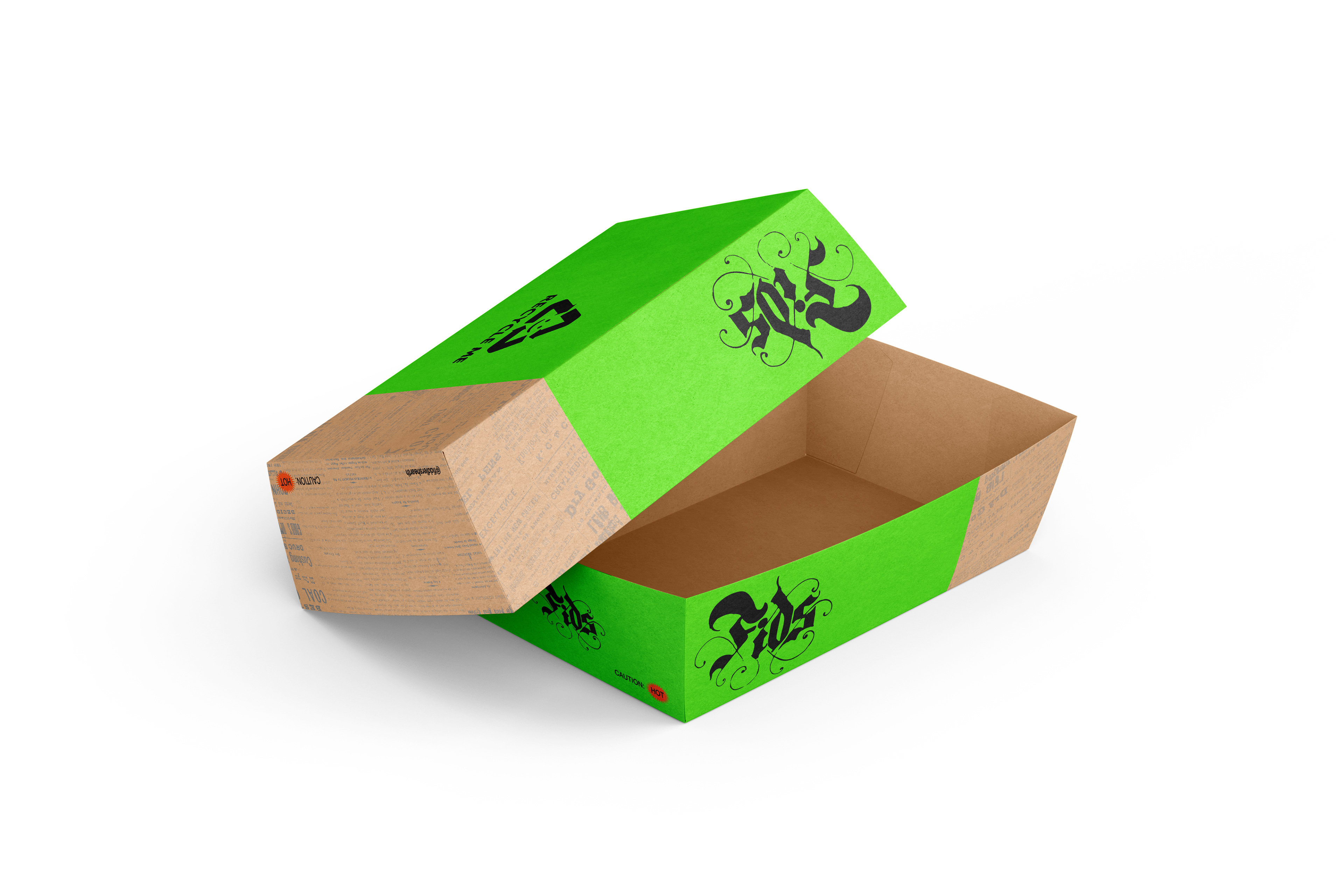
Mockups

Takeout Box A

Takeout box B
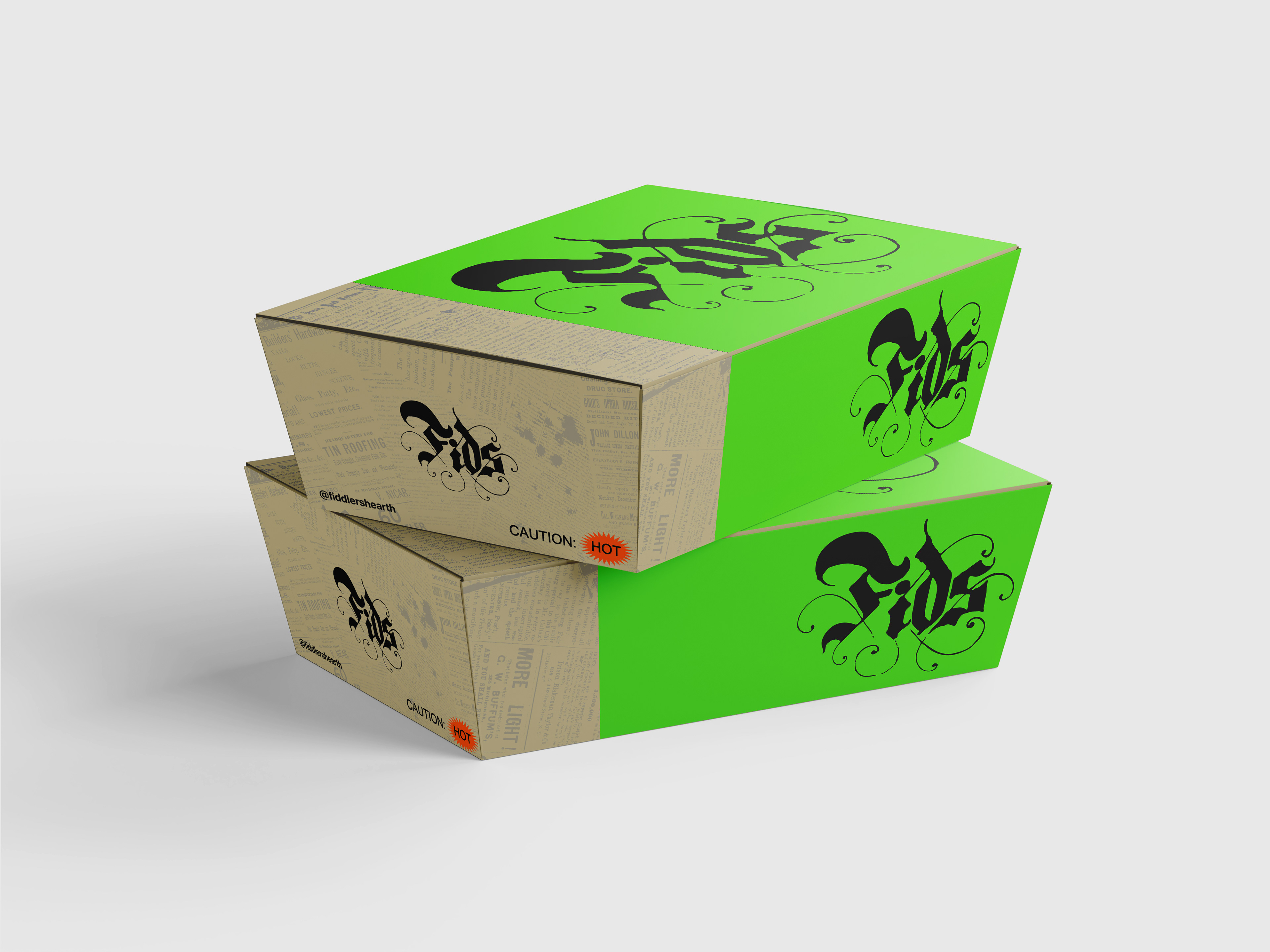
Takeout Boxes (stacked)
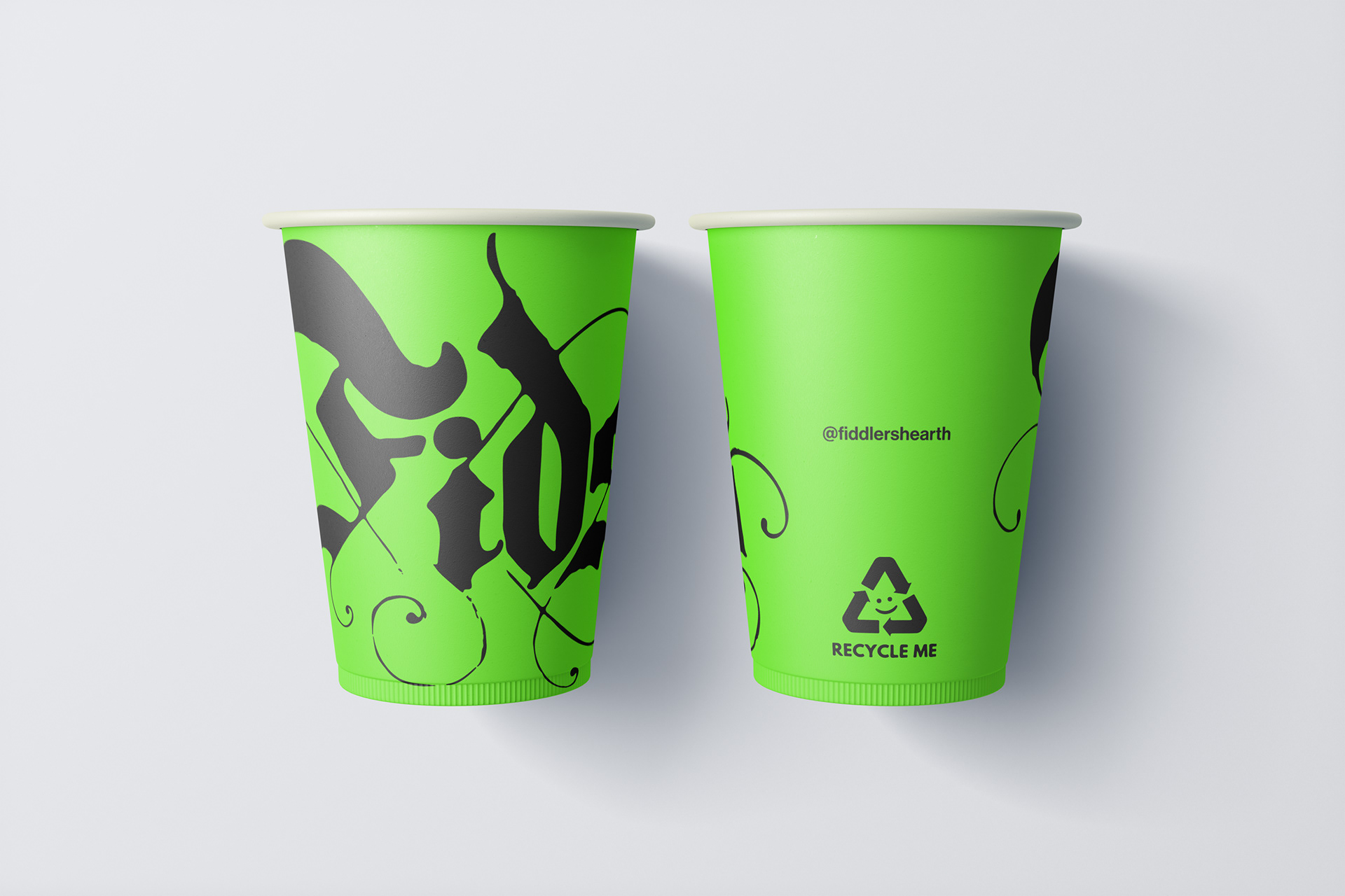
Paper Cups (front + back)
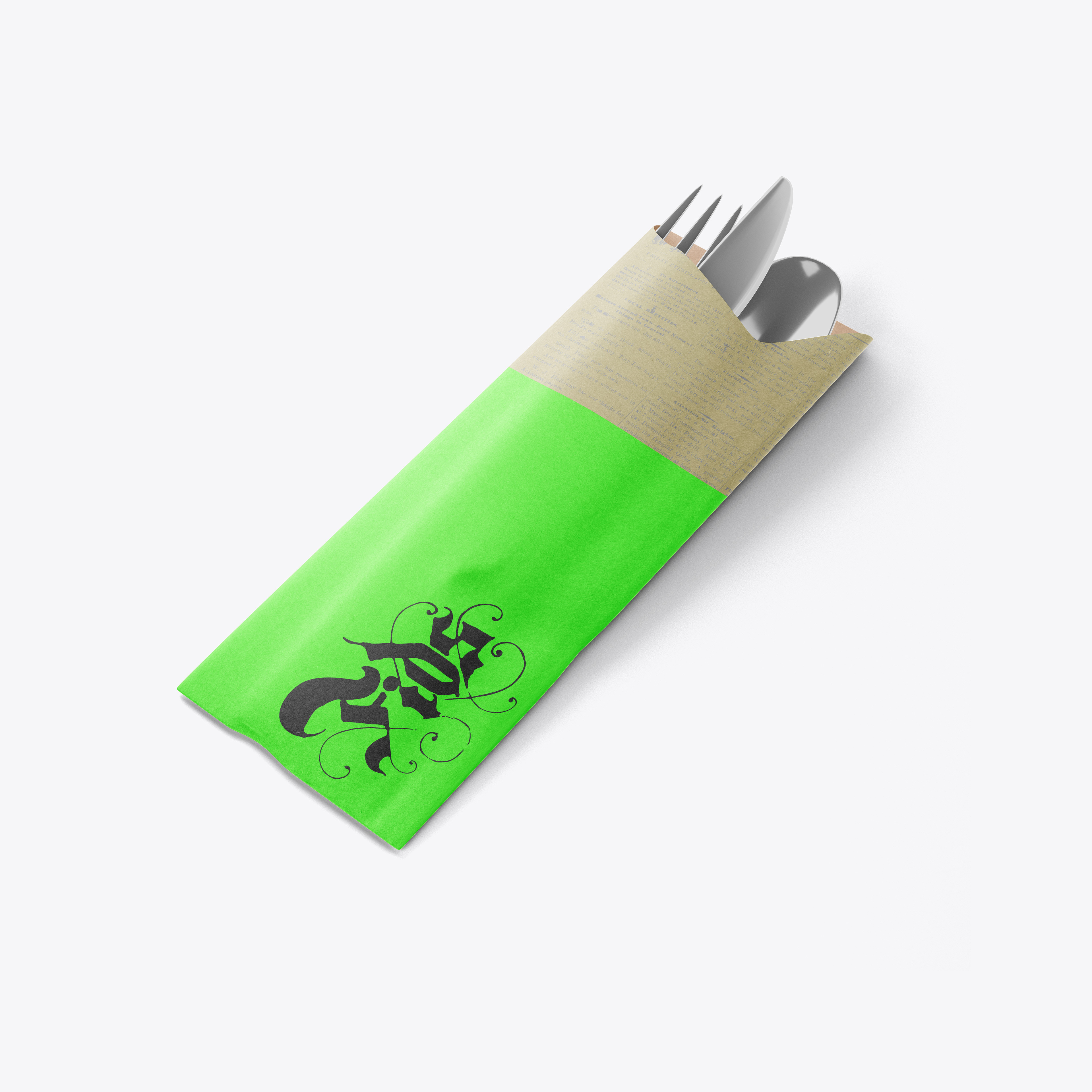
Utensil wrapper (front)
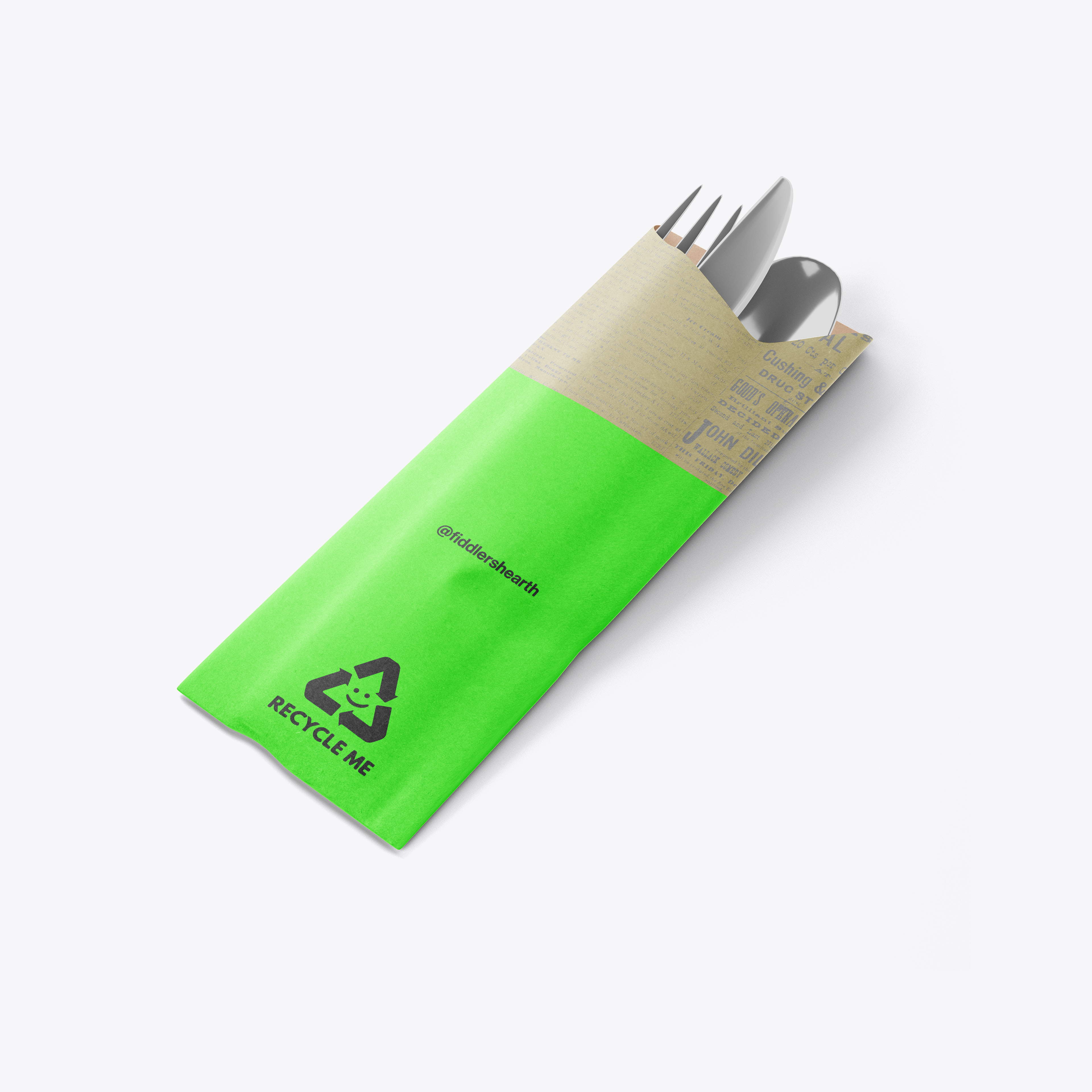
Utensil wrapper (back)

Stamp

Various Fid's stickers
Paper Boat (stacked)
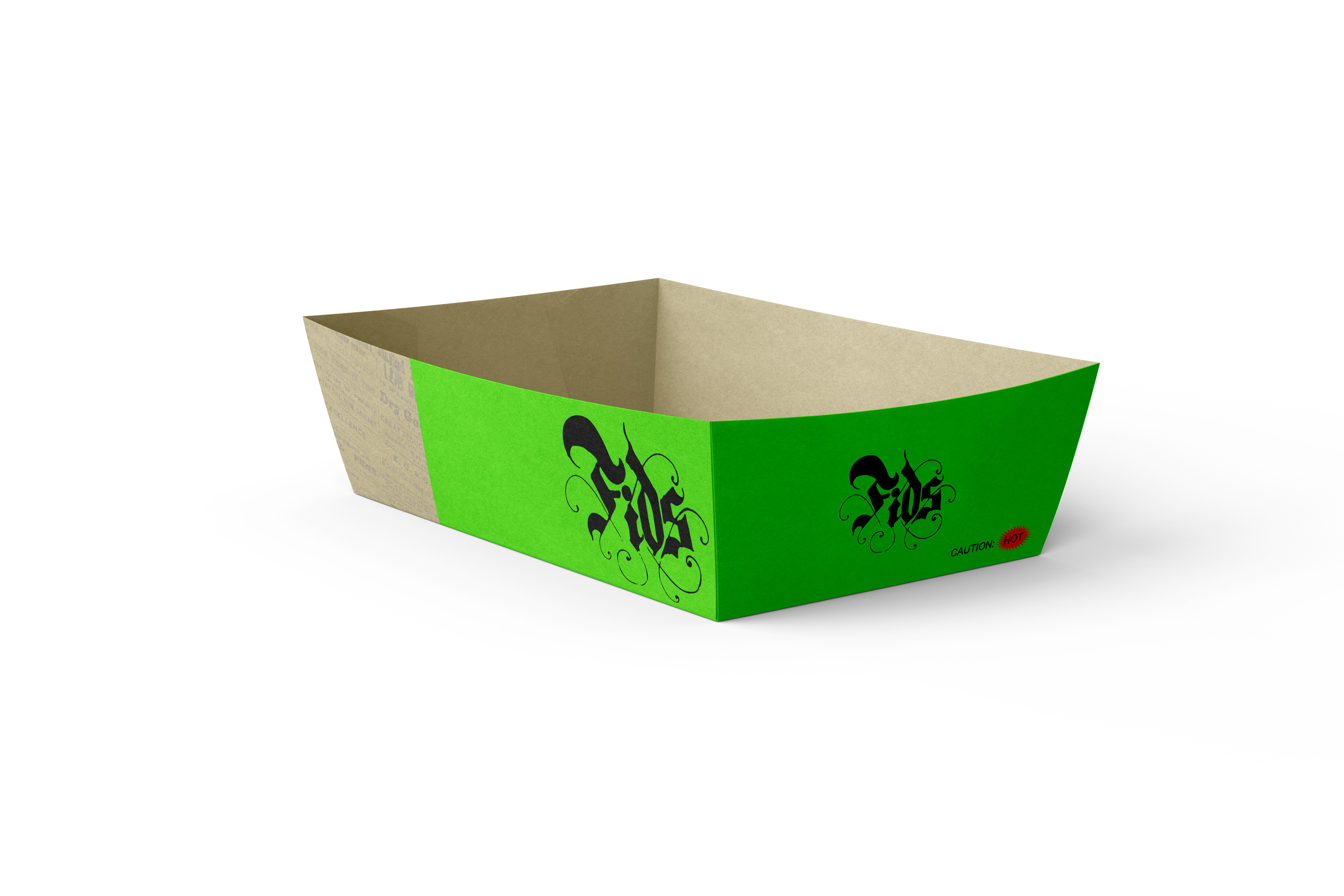
Paper Boat